2.5 How the price of the house is influenced by neighborhood? XAI methods for interpretation the black box model
Authors: Klaudia Gruszkowska, Bartosz Jamroży, Bartosz Rożek (Warsaw University of Technology)
2.5.1 Abstract
The value of a house is extremely important to all of us, no matter if we are buyers, sellers or homeowners. That is why correct price prediction is so important. With the help of machine learning we are able to predict this price but not every time we know what influenced such prediction result. For this reason, the interpretability of models, used in important areas of life, has recently become increasingly valuable. In this article we interpret and explain these unknowns using Explainable Artificial Intelligence (XAI) methods.
2.5.2 Introduction
Being able to predict the potential price of a house is crucial for the real estate market. Therefore, over the years, many papers have been focused on improving prediction methods (Ge et al. 2021; Park and Bae 2015). The main question regarding forecasts is what data influences the price. In addition to physical factors of the house, such as size, number of rooms, the condition of the building, the price is also influenced by the area in which the house is located. The neighborhood affects the price of the house and the house affects the value of the surrounding buildings. Thus, house price prediction models based on neighborhood data were created (Can 1990; Heyman and Sommervoll 2019; Law 2017).
With the development of artificial intelligence and machine learning, the use of this type of algorithm is gaining popularity in the field of forecasting house prices (Park and Bae 2015). In machine learning, we can distinguish two types of models: glass-box and black-box models. In the glass-box model human can follow the steps from inputs to outputs. Black-box models is also an important part of machine learning, however unlike glass-box models, they do not have a clear, human-readable way of determining predictions (Przemyslaw Biecek and Burzykowski 2021a). So why do we use them when we have glass-box models at our disposal? The complexity of black-box models is both an advantage and disadvantage at the same time. Due to it, we get better, more tailored predictions, but we also doom ourselves to the lack of precise information on how the given result was obtained.
Using algorithms, we would like to know what influenced the prediction result and how. We are not inclined to trust such a difficult and complicated activity to algorithms whose decisions are unclear to human. Therefore, in this paper we use Explainable Artificial Intelligence (XAI) methods (Barredo Arrieta et al. 2020b; Maksymiuk et al. 2020b) to analyze the output of the black-box model. XAI is a field of AI that aims to create more transparent and human understandable models while not losing the quality of explanations, and to create explanations for black-box models that enable people to understand and trust the prediction results.
Data
The data that was used was the California Housing Data Set. This data was initially featured in the following paper:(Pace and Barry 1997).The data pertains to the houses found in a given California district and some summary stats about them based on the 1990 census data. Data is cleaned, contains no empty information. Table 2.63 shows the explanation of each variable.
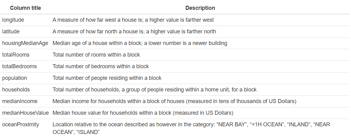
Figure 2.63: Meaning of the variables in the California Housing Data Set
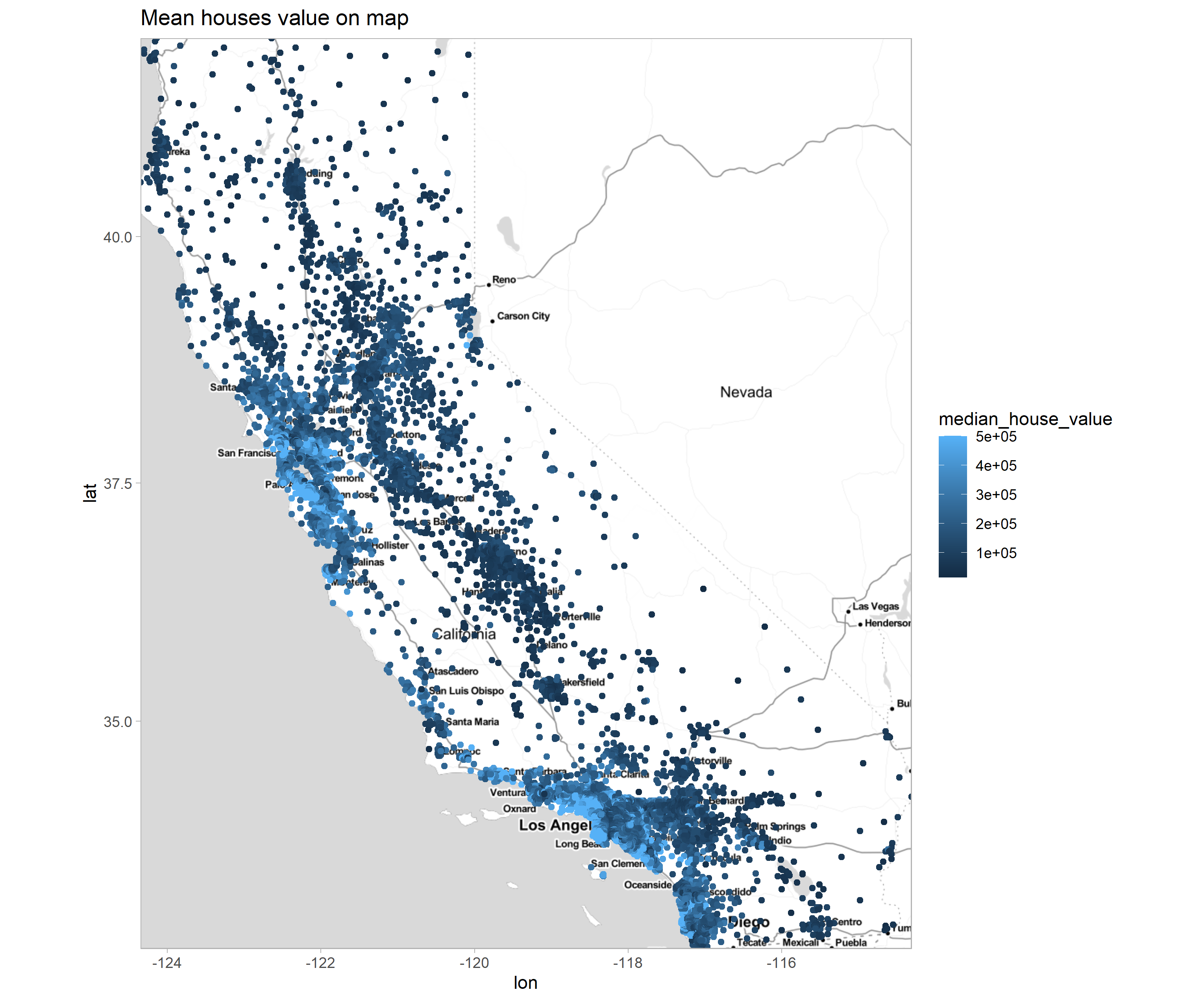
Figure 2.64: Map of property distribution within the state of California. The brightness of the points reflects the price.
The map 2.64 shows a density of bright blue dots in two locations, these are expensive properties located within two urban centers, Los Angeles, San Francisco, and San Diego. Also, more expensive properties are located along the Pacific coast.
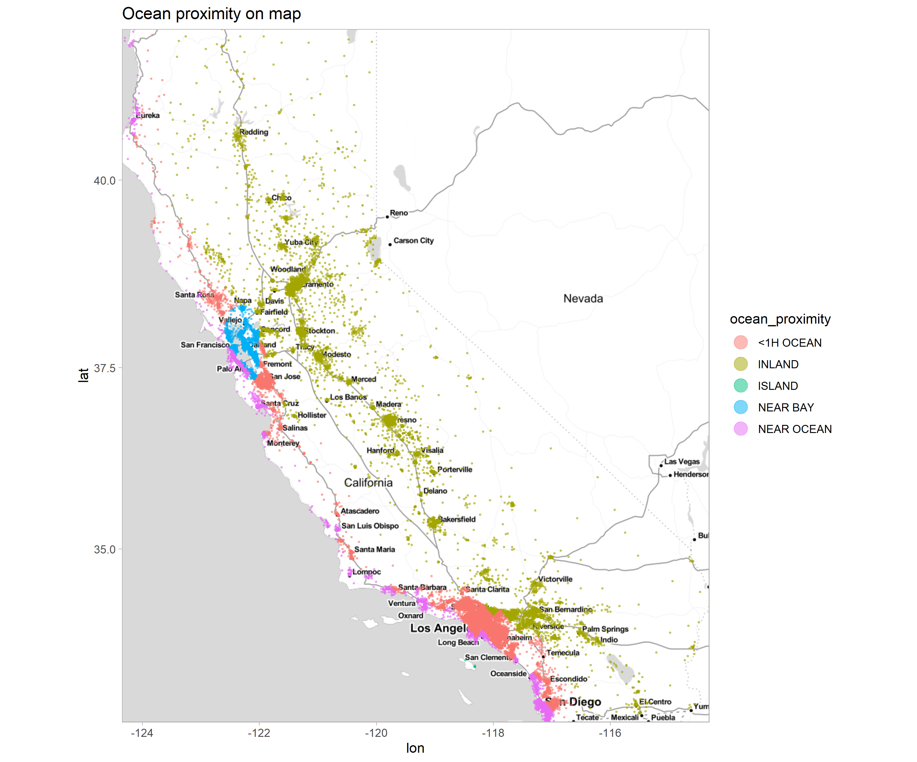
Figure 2.65: Map of property distribution within the state of California. Colors show the value of the oceanProximity column.
Property map 2.65, packing the ocean_proximity feature. Properties with the ‘NEAR BAY’ category colored blue, appear in only one grouping next to San Francisco, NEAR BAY means San Francisco Bay. Green category, ISLAND collects 10 properties located on one island near Los Angeles.
Machine learning model
The machine learning model explained is from https://www.kaggle.com/camnugent/introduction-to-machine-learning-in-r-tutorial. A random forest model(Breiman 1999) from the randomForest (Liaw and Wiener 2002b) library with parameters (ntree = 500, importance = TRUE) was used to predict property values. This model does not require scaling of data or decoding of categorical data. This makes it easier to analyze the results.
The two columns total_bedrooms and total_rooms were averaged by dividing by the number of household members. The new columns are mean_bedrooms and mead_rooms.
2.5.3 Literature
Over the years, many solutions have been developed for the task of house price prediction, and what particularly interests us, solutions using machine learning (Conway 2018; Fan et al. 2018; Park and Bae 2015). However, in our paper we will not focus on the process of creating good models but on the process of explaining models and their results using XAI methods.
Why are these explanations so important? As we mentioned in the introduction, black box models do not give us insight into the reason for their decisions. As mentioned in the article (Barredo Arrieta et al. 2020b) that is one of the main barriers AI is facing nowadays.
However, not everyone supports the development of XAI (Aivodji et al. 2019; Rudin 2019b ; Slack et al. 2020). They point to the insufficient credibility of the explanations and the possibility that the model conceal his unethical behavior.
The second issue addressed in our paper is the relationship of house price to location. Several works have been created on this topic as well. For example, Stephen Law in his work (Law 2017) proposed defining a street as a local area unit and measuring its effect on house price. The results of his research of Metropolitan London showed significant local area effects on house prices. In our case the local area unit is block, which is a rectangular area marked by intersecting streets. Another example is the article written by Robin A. Dubin (Dubin 1998). He points out the importance of the correlations existing between the prices of neighboring houses, which is ignored in others method of predicting house values.
2.5.4 Local explanations
Local explanations (Plumb et al. 2019) tells us, how model behaves in the area near given observation. Hence, it can not be used to explain how model works for whole set. It is useful to find out what can be done to change model’s prediction for observations we already have in our data set. We used observation 1 and 2000, because they are far from each other in the set so that they have different value.The location of the selected property is shown on the map 2.66, the precise data for these properties is shown in the table 2.67
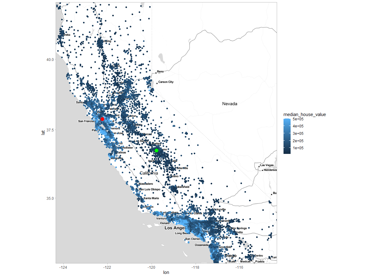
Figure 2.66: Choosen observations presented on a map. Red point - observation 1, green point - observation 2000

Figure 2.67: Precise data of two selected observations analyzed by local explanations, observations with numbers 1 and 2000
Break Down
Break down provides a way to show the local importance of variables and the effect of individual values on predictions(Gosiewska and Biecek 2019b). The basic idea is to calculate the contribution of variable in prediction of \(f(x)\) as changes in the expected model response given other variables. This means that we start with the mean expected model response of the model, successively adding variables to the conditioning. Of course, the order in which the variables are arranged also influences the contribution values.
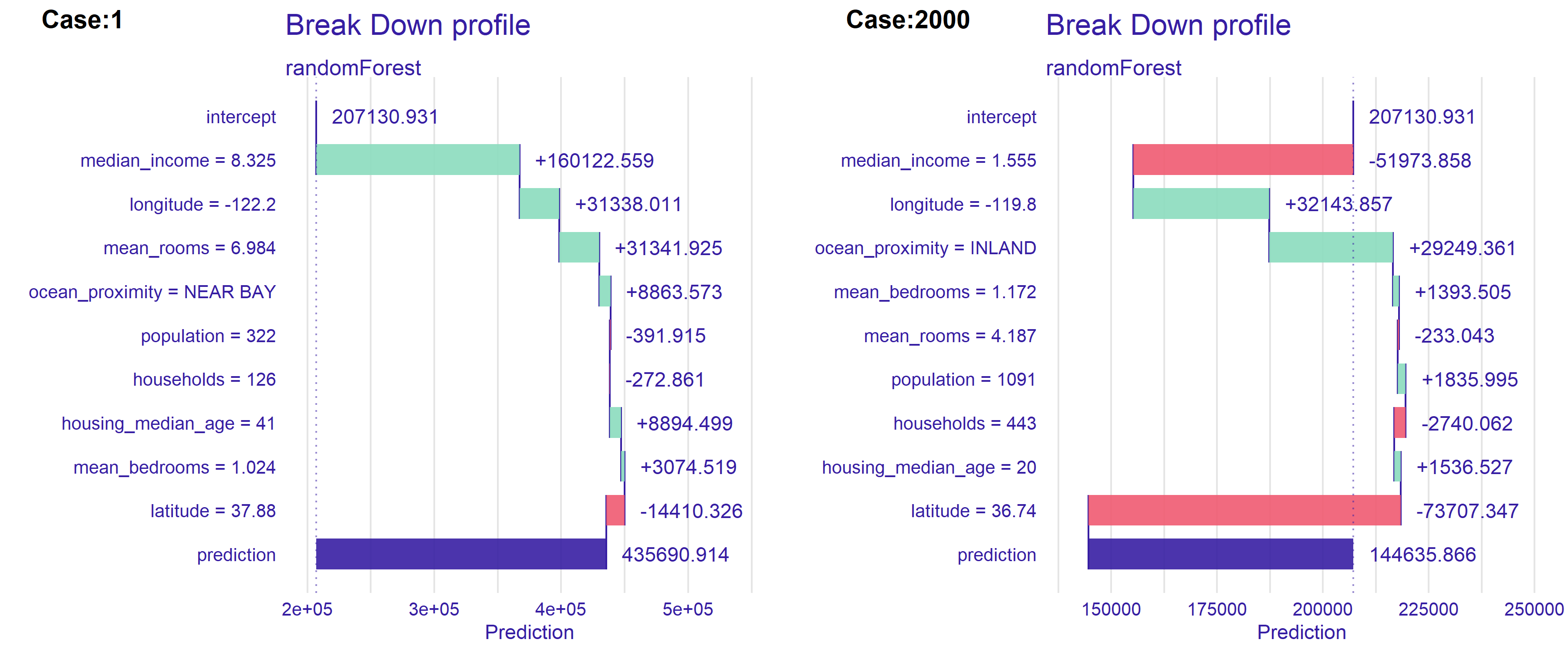
Figure 2.68: Break Down decomposition for (L) observation 1, (R) observation 2000. Bars show the contributions of the variables. Green indicates positive impact on the house value, while red indicates negative impact. First bar starts at the value of the mean expected model response.The last, blue bar indicates the difference between this mean response and the model prediction for the choosen observation.
Figure 2.68 shows the result of using Break Down method from DALEX (Przemyslaw Biecek 2018a) package.
The variables are ranked in terms of the importance of their impact on the predictions. The most important characteristic for both properties is median income. Median income is indicative of neighborhood status. Residents who earn more are likely to purchase more expensive properties. For both observations the influences are strong but opposite, high earnings for the first observation at $83,000 per year have a positive influence. In contrast, for property number 2000, earnings around $15 thousand per year are the reason why the model lowers the predicted price.
Longitude is the second significant feature. Average number of rooms and location relative to the ocean was also significant. Interestingly, in observation number 2000, the inland location raises the price. From the map 2.64, it appears that it is the homes farthest from the ocean that are the cheapest.
Lime
Local Interpretable Model-agnostic Explanations (LIME) was firstly proposed by Ribeiro, Singh, and Guestrin (Ribeiro et al. 2016b).
In LIME decomposition, our goal is to create an approximate glass-box model for an area around given observation. That model would be fully human-readable and can be easier analyzed. To do so, we create an artificial data set and teach the chosen glass-box model on it. The coefficients on the variables for the created model are the coefficients on the validity of the variables for our observation.
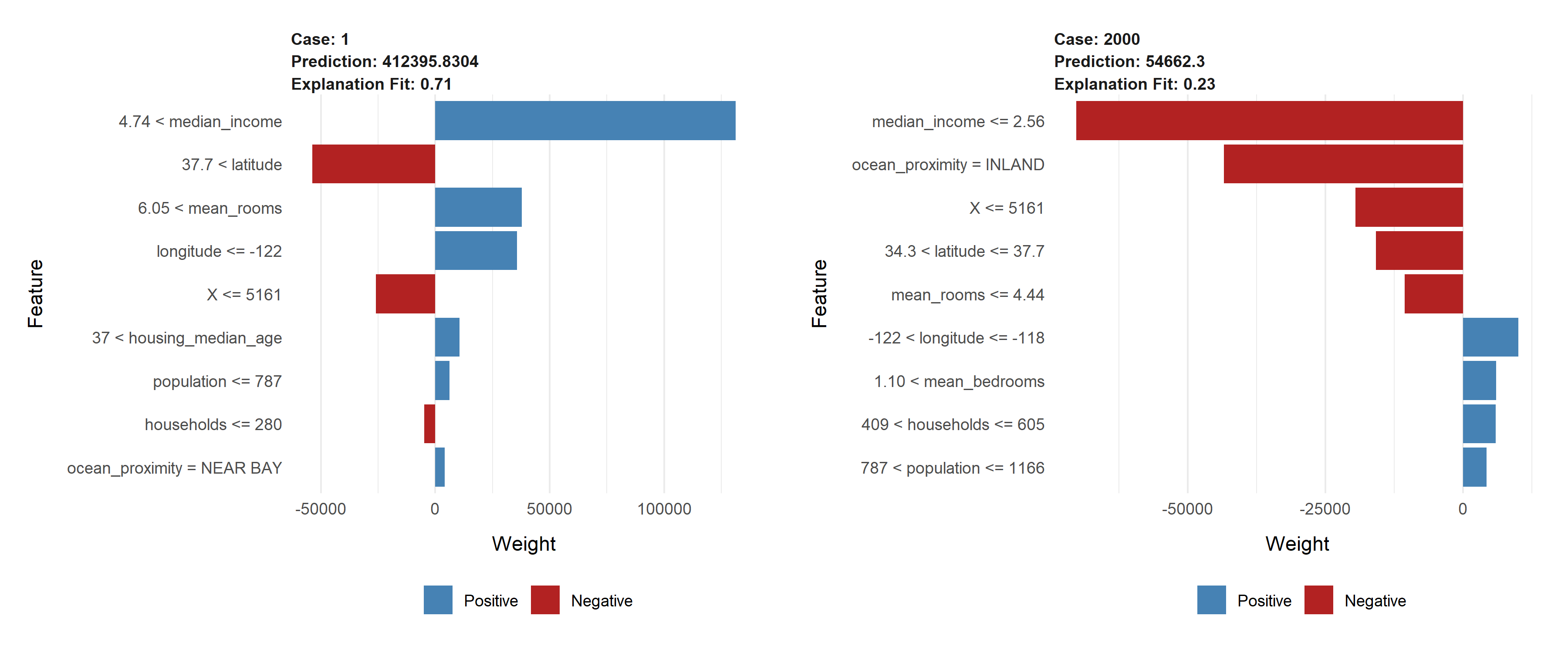
Figure 2.69: Lime decomposition for (L) observation 1, (R) observation 2000. The size of the bar indicates the magnitude of the the estimated coefficient. Features with blue bar have positive sign of the estimated coefficient and feature with red bar have negative sign of the estimated coefficient.
Figure above 2.69 shows the result of using LIME method (Ribeiro et al. 2016b) from DALEX (Baniecki et al. 2020a) package. Common for both observations is that the median_income variable has the largest effect on prediction. However, the impact in the case 1 is large positive but in the case 2000 it is large negative. It is caused by the value of the variable. It is worth noting that the variables longitude and latitude have opposite signs in both cases. This is because these variables are negatively correlated. The second most valuable variable is the map location variable.
It follows that for the observations, the key variables are median_income and some kind of location. This is consistent with our expectation and intuition that the higher the earnings of residents, the richer and more valued the neighborhood. Consequently, the houses themselves are also priced higher. Additionally, plots show us that impact of populationor households is not significant.
What is interesting, in the case 2000 above 2.68 BreakDown as opposed to LIME found the location ocean_proximity = INLAND to be positive.
Ceteris Paribus
Ceteris Paribus is a phrase that comes from Latin. Word for word meaning is “other things equal,” but in XAI much more meaningful translation would be “other things held constant.” In fact, these few words describe this method deeply - we choose one variable from observation, change it’s value, while other variables held constant and calculate new model’s prediction. Output of this operation is a function that shows us how prediction changes.
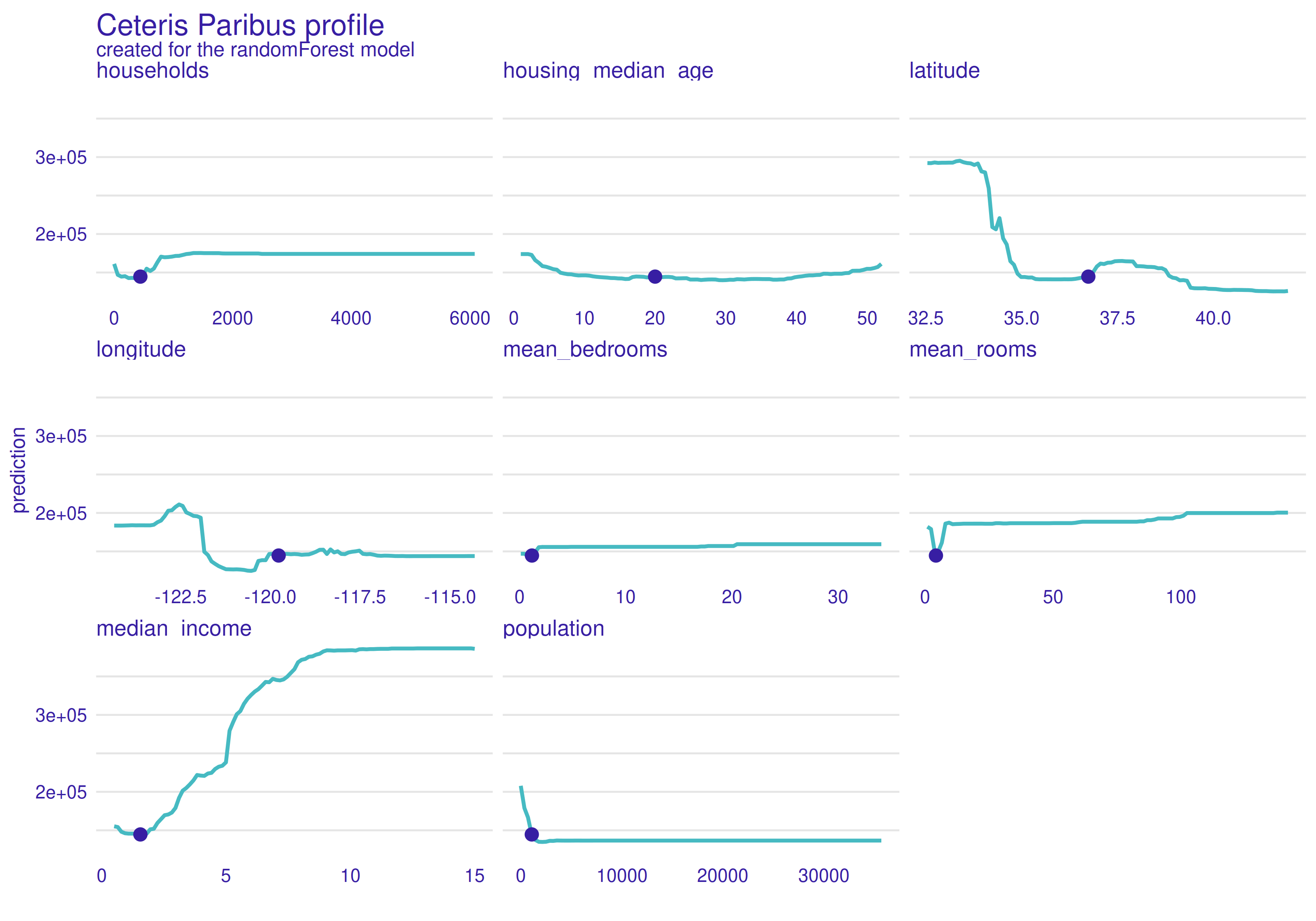
Figure 2.70: Ceteris Paribus profiles for the first observation. Blue dot is the actual value of the variable for this observation. The line indicates the change in prediction when the value of the variable changes.
Plot 2.70 above shows Ceteris Paribus calculated for first observation of data set. As we can see, in most cases it is straight line with change for small values. Households and population profiles are similar, which seems to be reasonable, because not many people look for apartment in a remote area. Latitude and longitude profiles are vertical lines with one decrease. Hence, a region on map can separated where median value would be the highest.Mean rooms is hard to explain in the opposition to mean bedrooms where we can see that the more bedrooms the higher the value is. It stops at certain value, above which valuation doesn’t change. Median income is almost linear function, which is understandable as rich people can afford expensive apartments.
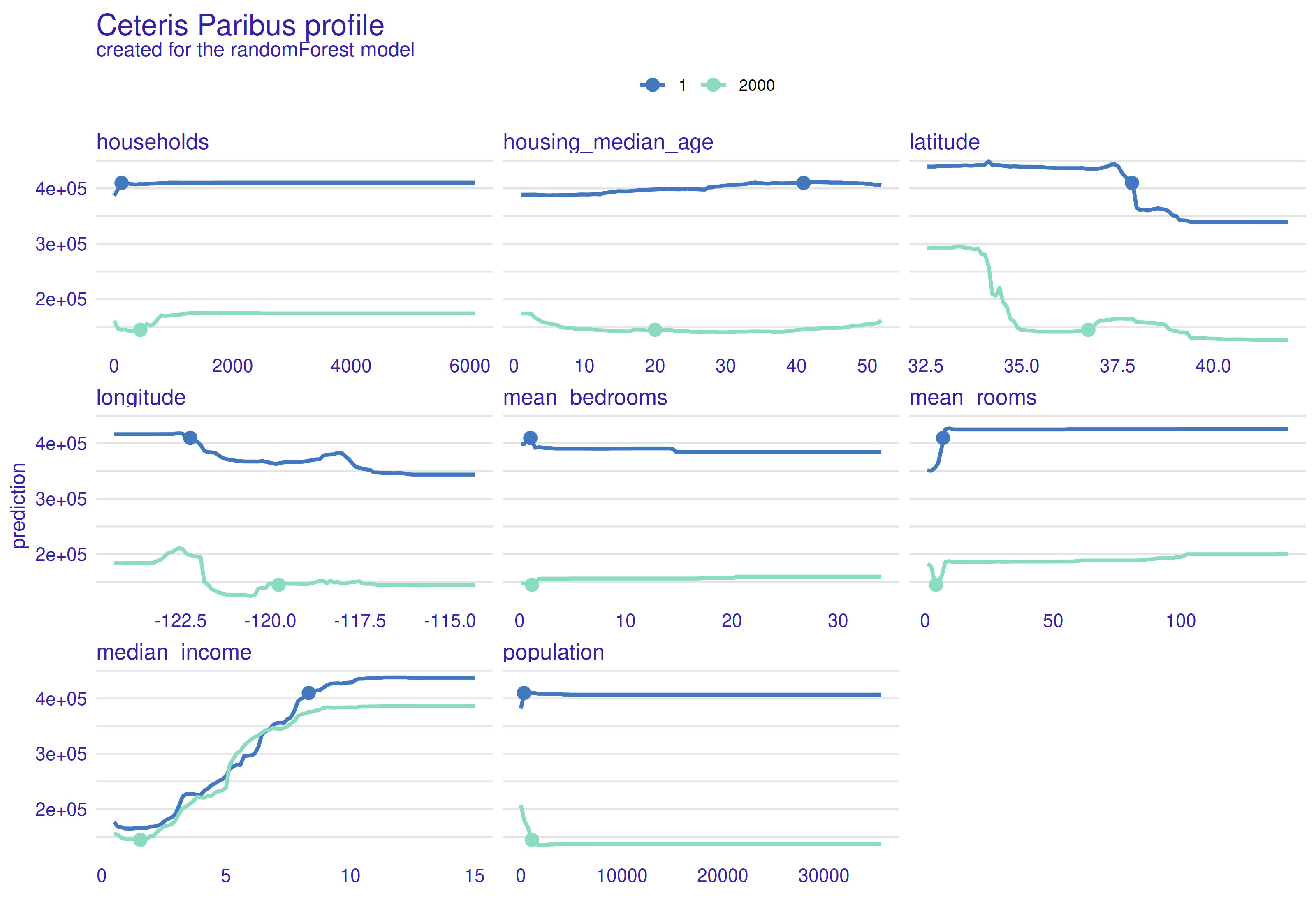
Figure 2.71: Ceteris Paribus profiles for the first and 2000th observation. Blue line indicates changes for first observation and green indicates changes for 2000th observation. Dots are actual values of the variables for observations.
Next plot 2.71 shows Ceteris Paribus calculated for two different observations. Specially two observations with massive difference in median value where chosen to observe what would change. Clear differences can be observed. Especially latitude, mean bedrooms, mean rooms and population shows major changes. Rest of variables have similar profiles, but these four are great example why shouldn’t we draw conclusions about whole data set based on one ceteris paribus calculation.
Local explanations conclusions
As it could be observed, local explanations tells a lot about given observation. Unfortunately, juxtaposition of two different observations showed us, that they can have totally different explanations. Hence, local XAI, in this case, would allow us to increase already built house’s value rather than give an instruction how to build expensive property. To get this instruction global explanations should be used.
2.5.5 Global explanations
In global explanations (Plumb et al. 2019), we want to find out what influenced the model as a whole in the data, rather than looking at individual observations. This gives us an overall view of the predictions for the population. We can use this information to construct new observation with desirable value of target variable.
Feature Importance
Idea of permutation-based variable-importance(A. Fisher et al. 2019c): If a variable is important in a model, then after its permutation the model prediction should be less precise. The permutation importance of a variable \(k\) is the difference between model prediction for original data and prediction for data with permutation variable \(k\).
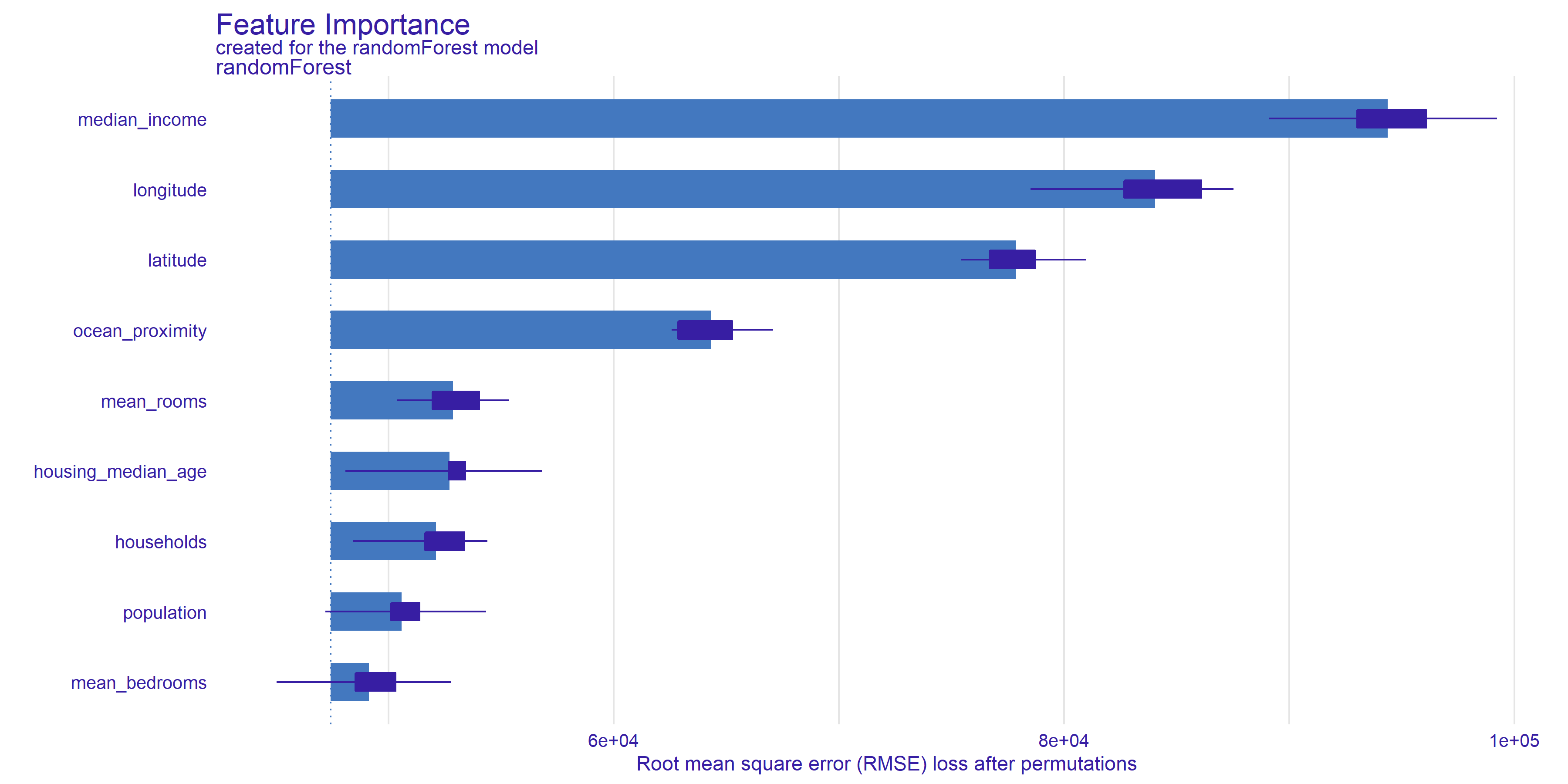
Figure 2.72: Feature Importance plot shows the root mean square error after 10 parmutation of every variable. Bars indicate the mean value of RMSE and at the ends of the bars are boxplots created from all permutation results.
Plot 2.72 show, Median income turns out to be the most important feature for the model under study. Removing the median income information by permutations, resulted in the largest decrease in the RMSE measure. This means that without this feature the model is much less precise.
The geographic variables, longitude latitude and ocean proximity also turn out to be important for prediction.
The average number of rooms, age, and the number of householders already have less impact on the prediction.
The mean bedrooms category has the smallest and ambiguous impact. Whiskers extending beyond the left border of the bars indicate that there were draws where removing the variable improved the model results. The model may ignore this feature, having partial information about it in the form of number of rooms and household members.
If we go back to Break down section, we can observe a few similarities. First of all, median income is very important for valuation in Break down and is in the first place in feature importance’s ranking. After that, on following places there are features related to geographic location. In general, they are important for Break down as well. If we take a look on
bottom part of feature importance plot, three worst features - mean bedrooms, population and households have tiny contribution for both Break down’s cases. To sum up, these methods gives similar results and differences are due to different samples (one observation vs whole data set).
PDP
PDP (Friedman 2000a) stands for partial dependence plot and it is connected with Ceteris Paribus. We take a random sample from data set, and calculate ceteris paribus for each one. After that, mean of all these functions is calculated, which leaves us with one profile for whole data set. In the plot below thick blue line is PDP and thin grey lines are Ceteris Paribus calculations for each observation.
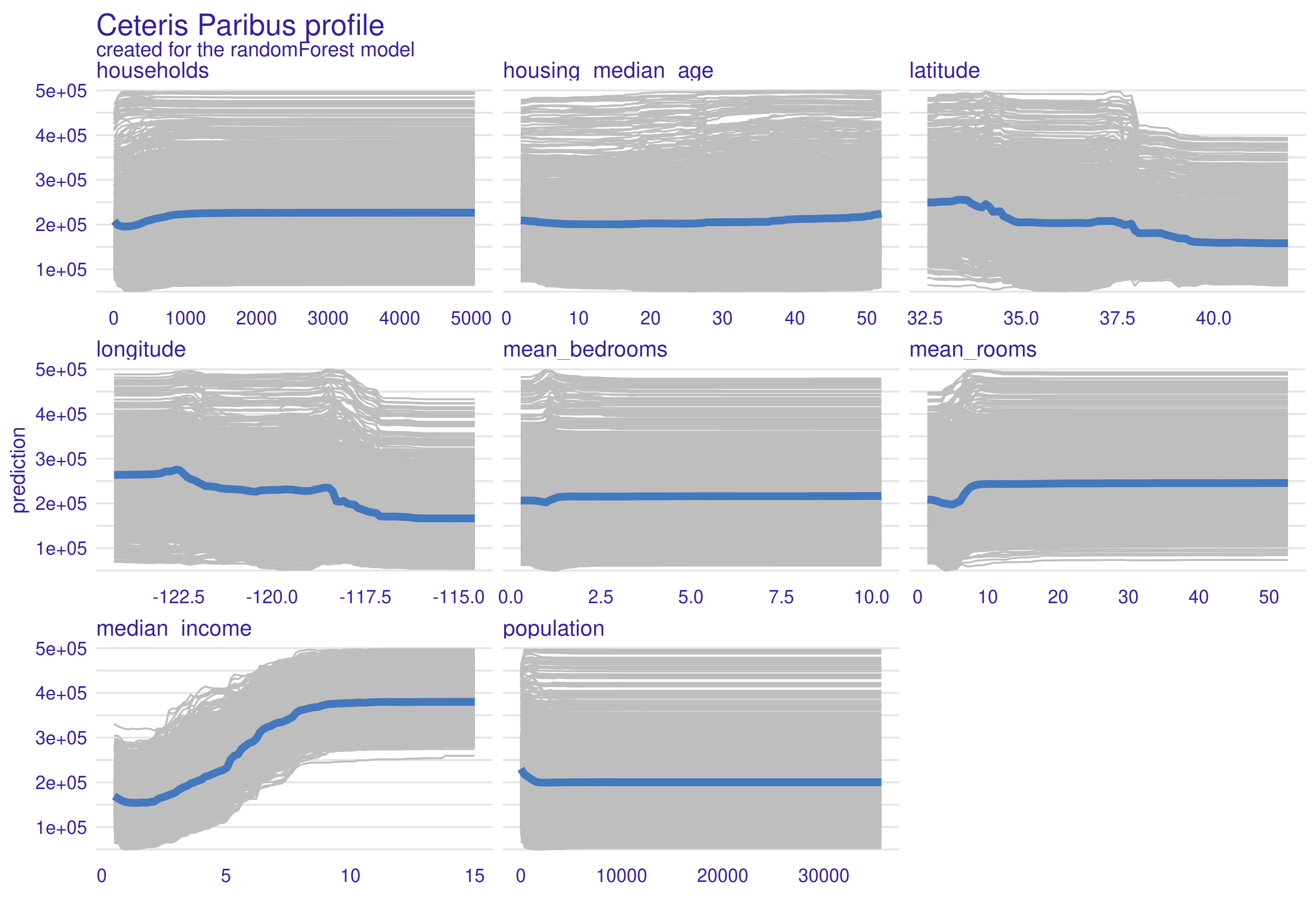
Figure 2.73: Partial-dependance profiles (PDP). Grey lines are Ceteris Paribus profiles for each calculations, and blue line is PDP (mean of all Ceteris Paribus functions). The line indicates the change in prediction when the value of the variable changes.
As we can see above 2.73, households, mean bedrooms, mean rooms and population profiles are almost straight lines with fluctuations for small values. Housing median value is a interesting case, because small curvature can be observed at the end of line. This is probably due to the fact that new apartments are expensive, because they are modern and old ones are expensive because of historical background behind they. Latitude shows that most expensive houses are located on south, especially below \(34 ^{\circ} N\), in California this is area near Los Angeles. Median house value is highest for longitude values lower than \(118 ^{\circ} E\) (majority of a state except of San Diego and surrounding area). As it was in ceteris paribus, median income grows together with median house value to the level where income money simply doesn’t matter.
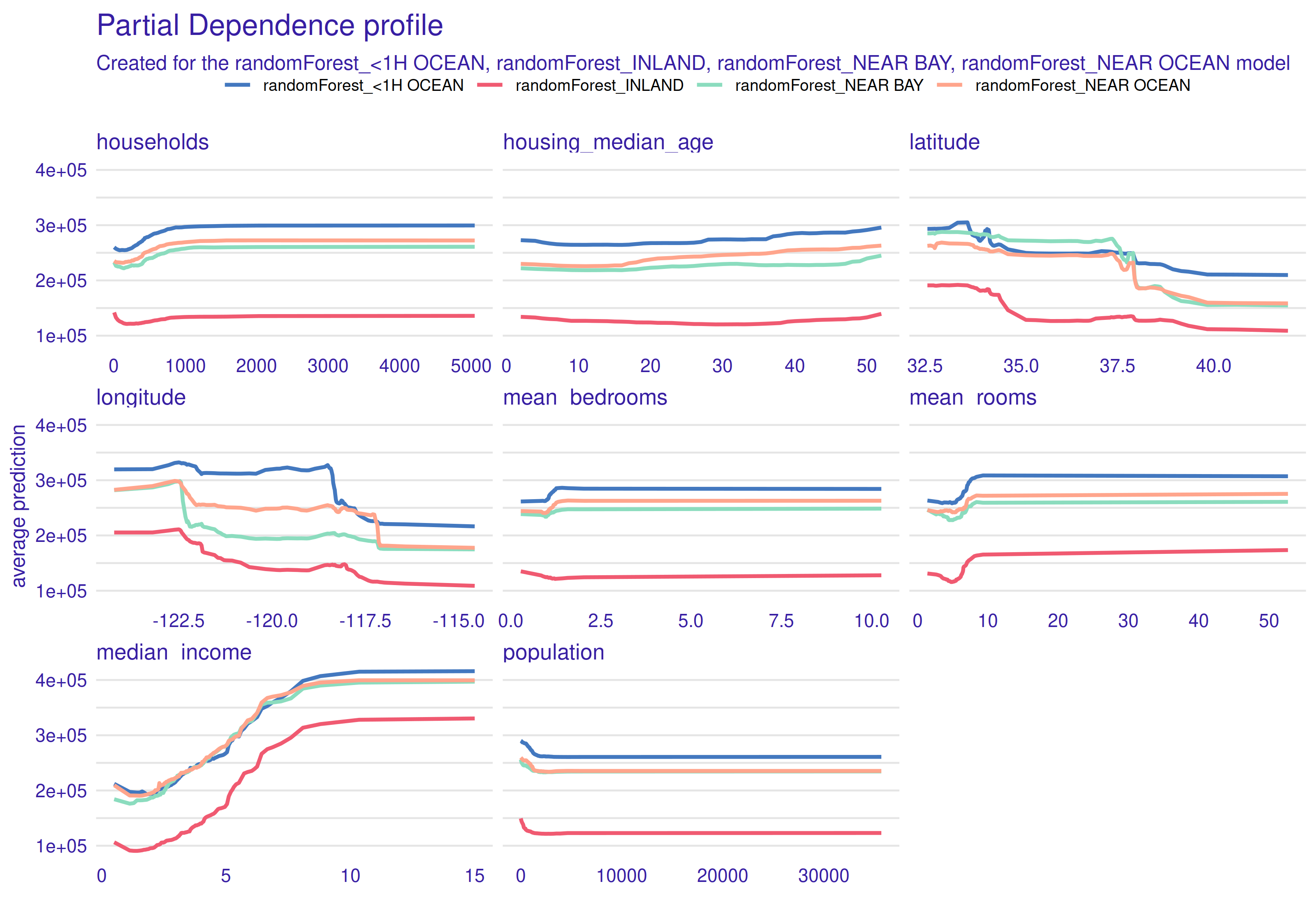
Figure 2.74: Partial-dependence profiles for separate ocean proximity values. Each line of a different color corresponds to a PDP for observations belonging to one category.
PDP makes it possible to create separate profiles for different groups of observation. In our case, we used ocean proximity as it is a categorical variable. In the plot 2.74 above we can observe, that all profiles are similar to each other, the only significant difference is vertical shift. Conclusion drawn from this plot is the fact that houses 1h <Ocean are most expensive, inland apartments are the cheapest, while near ocean and near bay behave similar to each other and have average prices. If we take a look at the plot from Data paragraph, conclusions look reasonable. 1h <Ocean houses are the ones located in Los Angeles and in the suburbs of San Francisco, which are well known from expensive neighborhoods.
Global explanations conclusions
In contrast to local explanations, global explanations give a more general picture of the entire data set. With PDP profiles, we can see the relationships between the data. The future importance graph allows understanding what variables are relevant to the model.
2.5.6 Conclusion
XAI methods can have multiple applications. They allow to study the behavior of Machine Learning Models. It gives an opportunity to understand the model, detect errors, for example, made during data preprocessing.With a good model matched to the data, XAI can be used to study the dependencies in the data.
In this paper using XAI methods we made local and global explanations for the random forest model and 1990 California house data. This allowed us to bring the black box model closer to an interpretable as we learned the approximate effects of the variables on the prediction output. All the methods we used, Break Down, Lime, Ceteris Paribus for local explanations and Feature Importance, PDP for global explanations, indicated median income as the variable with the greatest influence on the prediction score. By combining the XAI methods with the results of the EDA analysis, we were able to observe and intuitively explain the findings.
In the local explanations section we took a closer look at two very different observations and tested at the observation level how their variable values, affected the prediction outcome, and in the global explanations section we took a broader look at the performance of the model for the whole data set.
In summary, our results provide insight into the value of using XAI methods to better understand black box models used for real-world problems such as, in our case, the real estate market and the impact of location-specific factors on house price.