2.4 Explaining diabetes indicators
Authors: Martyna Majchrzak, Jakub Jung, Paweł Niewiadowski (Warsaw University of Technology)
2.4.1 Abstract
Nowadays, Machine Learning is widely used in many more or less scientific fields. Some interesting ones include economy, social networking and medicine. Sometimes however we need not only a well performing model but also an understable one. The Explainable Atrificial Intelligence (XAI) is still pretty new concept and has a lot of potential for its use. In this paper we harness XAI methods for a real world medicine problem. We take a look at the diabetic data, build a decent model based on it and try to understand what conclusions the model has reached. As a result of our experiment we will try to understand what factors contribute to higher chance of diabetes occurence.
Keywords: Machine Learning, Explainable Artificial Intelligence, XAI, Classification, Diabetes
2.4.2 Introduction
Machine Learning is a field of studies that is concerned with constructing algorithms that can learn using existing data and improve their performance with experience. Thus it allows predicting the unknown information with measurable certainty. With the rise in popularity of Machine Learning algorithms people started questioning the solutions obtained by computers’ calculations. Sometimes it does not matter how high the performance measures of the algorithm are, if we do not understand the reasoning behind its decisions. Therefore, the real problem is the lack of tools for model exploration, explanation (obtaining insight into model-based predictions) and examination (evaluation of model’s performance and understanding the weaknesses). As an answer a whole new branch of AI has been formed - Explainable Artificial Intelligence (XAI) (Przemyslaw Biecek and Burzykowski n.d.).
The deep understanding of the model decision making is particularly important in medicine, where any misprediction can have fatal consequences.
Two areas which may benefit from the application of ML techniques in the medical field are diagnosis and outcome prediction. This includes a possibility for the identification of high risk for medical emergencies such as relapse or transition into another disease state. ML algorithms have recently been successfully employed to classify skin cancer using images with comparable accuracy to a trained dermatologist and to predict the progression from pre-diabetes to type 2 diabetes using routinely-collected electronic health record data (“Machine learning in medicine” n.d.).
In this article we attempt to find the relationship between different biomarkers and positive diagnosis of diabetes based on the data of over 700 women of Indian ancestry (Pima tribe) collected by the National Institute of Diabetes and Digestive and Kidney Diseases. In order to do that, we used XAI tools on our black box models to present the decision making process of algorithms in understandable for humans way from which we could later draw conclusions.
2.4.3 Methods
In this section we will discuss the methodology behind the conducted experiments.
Dataset
The dataset consists of 768 observations of 8 features being different biomarkers and 1 target variable (class) indicating that the woman was diagnosed with diabetes.
preg: number of pregnanciesplas: plasma glucose concentration (mg/dL) at 2 hours in an OGTT (oral glucose tolerance test) - a test in which subject is given glucose and blood samples are taken afterwards to determine how quickly it is cleared from the bloodpres: blood pressure (mm Hg)skin: triceps skinfold thickness (mm) measured at the back of the left arm. A measurement giving rough information about body fat percentage.insu: 2-hour serum insulin (mu U/ml)mass: BMI index (weight in kg/(height in meters)^2)pedi: diabetes pedigree function outcome, where DBF is a function that uses information from parents, grandparents, siblings, aunts, uncles, and first cousins and provides a measure of the expected genetic influence of affected and unaffected relatives on the subject’s eventual diabetes riskage: age (years)class(target): 1 if tested positive for diabetes, 0 otherwise
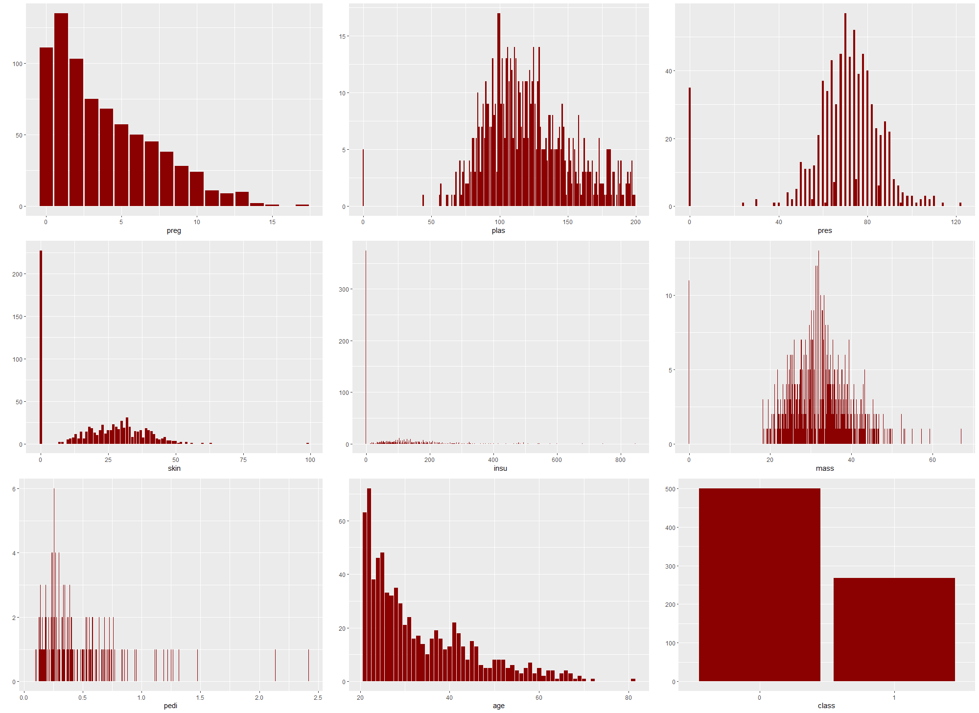
Figure 2.43: Distributions of features and target in the original dataset
The dataset did not have any missing data, however after analysing the feature distributions (Figure 2.43) and their meaning we found many 0 values that made no sense and were not physically possible (for example 0 value of mass which is BMI index - mass (in kilograms) divided by squared height (in meters)). According to an article about cost-sensitive classification (Turney 1995), which addressed this dataset it is possible that some tests had never been carried out for some patients. This meant that the 0 values in our dataset (for features other than preg and class for which they absolutely make sense) were actually missing values.
Dataset versions
During preprocessing and based on the observations of our first models 4 different versions of dataset were created and later used to train the models. First, the dataset was randomly divided into a training dataset (70% of data) and testing dataset (30% of data). Then the datasets were individually modificated in the following way:
original - base dataset with no modifications
naomit - base dataset excluding observations with any missing values
mice - base dataset with all missing values imputed with mice (Multivariate Imputation by Chained Equations) package using PMM method. (van Buuren and Groothuis-Oudshoorn 2011) Mice is suitable for this dataset, since the values are missing at random.
skip - base dataset excluding features
skin,insuandpreswith missing values inmassandplasimputed with mice package
The details of dataset versions are shown in table 2.4.
| Dataset | Rows Train | Rows Test | Columns |
|---|---|---|---|
| original | 537 | 231 | 9 |
| naomit | 372 | 160 | 9 |
| mice | 537 | 231 | 9 |
| skip | 537 | 231 | 6 |
Measures
For the assessment of the model in our experiment we will use three commonly known measures, available in mlr package (Bischl et al. 2016b):
- AUC - Area Under ROC Curve
An ROC curve (receiver operating characteristic curve) is a graph that shows the performance of a classification model at all classification thresholds. This curve plots two parameters: TPR (True Positive Rate) and FPR (False Positive Rate), defined as:
\(TPR=\frac{TP}{TP+FN}\)
\(FPR=\frac{FP}{FP+TN}\)
- BAC - Balanced Accuracy
This measure is a weighted accuracy, that is more suitable for datasets with imbalanced classes.
- FNR - False Negative Rate
It corresponds to the number of cases where model incorrectly fails to indicate the presence of a condition when it is present, divided by the number of all.
\(FNR=\frac{FN}{TP+FN}\)
It is particularly important for medical data models, because it indicates how many sick patients are going to be categorised as healthy, and therefore not get any treatment.
Models
To identify the models, that could potentially be efficient classificators on this dataset, we measured the AUC, Balanced Accuracy and False Negative Rate measures on 6 different classification models from mlr package:
Tree-based models:
Random Forest - Random Forest (Liaw and Wiener 2002a)
Ranger - Random regression forest (Wright and Ziegler 2017c)
Boosting models:
Ada - Adaptive Boosting (Culp et al. 2016)
GBM - Gradient Boosting Machine (B. Greenwell et al. 2020)
Other:
Binomial - Binomial Regression (R Core Team 2021)
Naive Bayes - Naive Bayes (Meyer et al. 2020)
2.4.4 Explanations
In this section we will take time to introduce some model explanations that we will be using later. Feel free to use this chapter as reference for quick overview. For more in-depth knowledge please refer to paper (Przemyslaw Biecek and Burzykowski n.d.) All images in this section are also taken from this article. Explanations themselves were implemented in the DALEX (Przemyslaw Biecek 2018b) and DALEXtra (Maksymiuk and Biecek 2020b) package.
Local Explanations
Local explanations allow us to better understand model’s prediction from the level of single observations. This can be useful when we want to evaluate predictions for certain instances. For example, which values have the most importance for the particular observations, or how the change in variables would impact the result. Local explanations combined with professional expertise could sometimes hint towards potential problems with the model in case they contradict each other.
- Break Down
In Break Down explanation (Staniak and Biecek 2018a) all observations start from the same base that is the mean prediction for all data. Next steps consist of fixing consecutive variables on values from the observation in question and measuring the change in mean prediction that is now calculated with some of the values fixed. This shift in mean prediction is interpreted as the impact of this variable’s value on prediction for this observation. Figure 2.44 shows the corresponding steps.
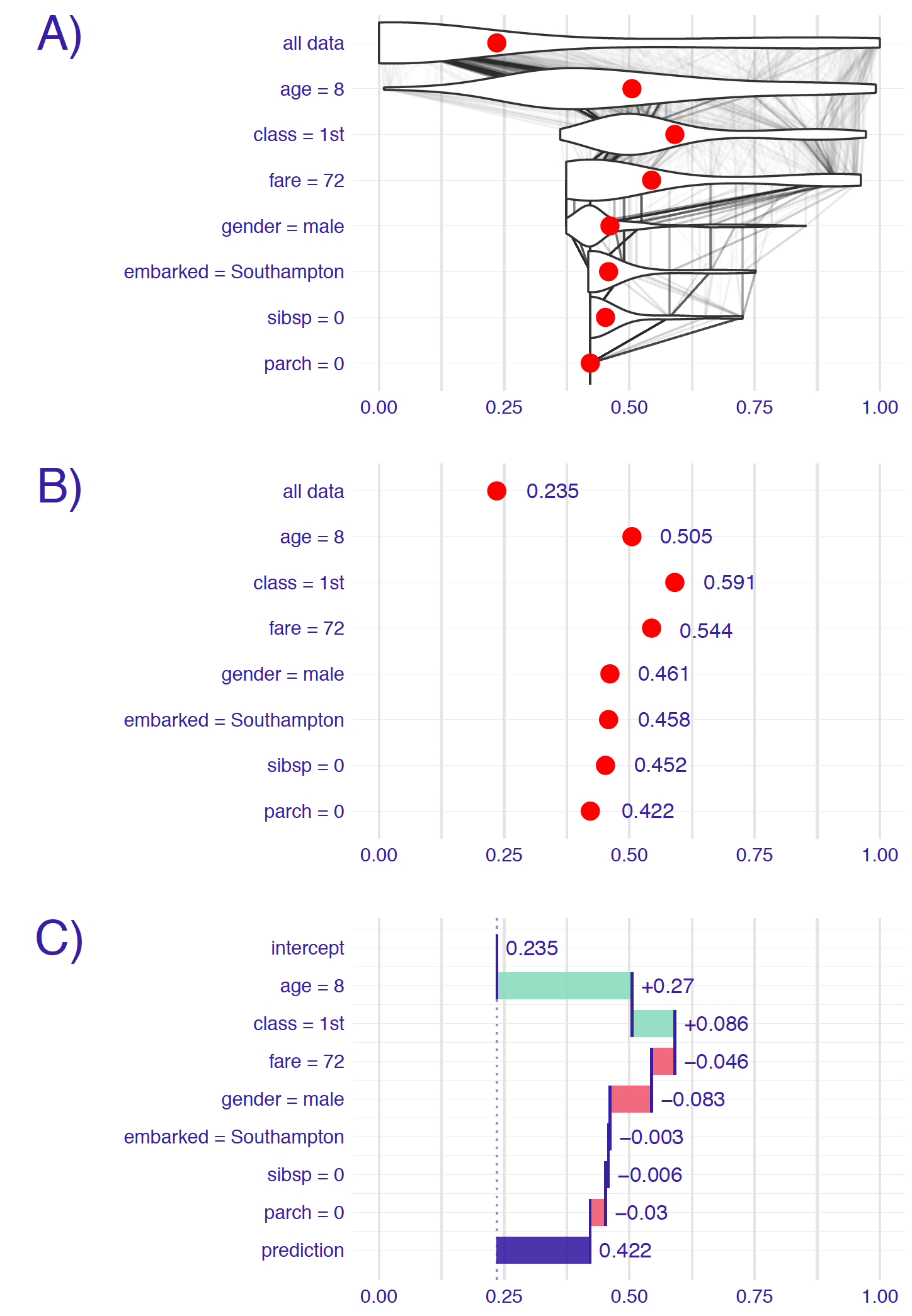
Figure 2.44: Panel A shows the distribution of target values: in the first row overall distribution, and on the subsequent ones - distribution from the previous row with fixed value of the variable written on the left. For example, in the third row values of age and class variables are fixed. The red dot represents the mean of the distribution. On panel B only the mean value is shown. On panel C the change in mean (average impact) is calculated and assigned to corresponding variables.
A big drawback for this method is how the order of variable can influence the explanation outcome. This problem occurs most often as a result of existing interactions between variables as seen in figure 2.45.
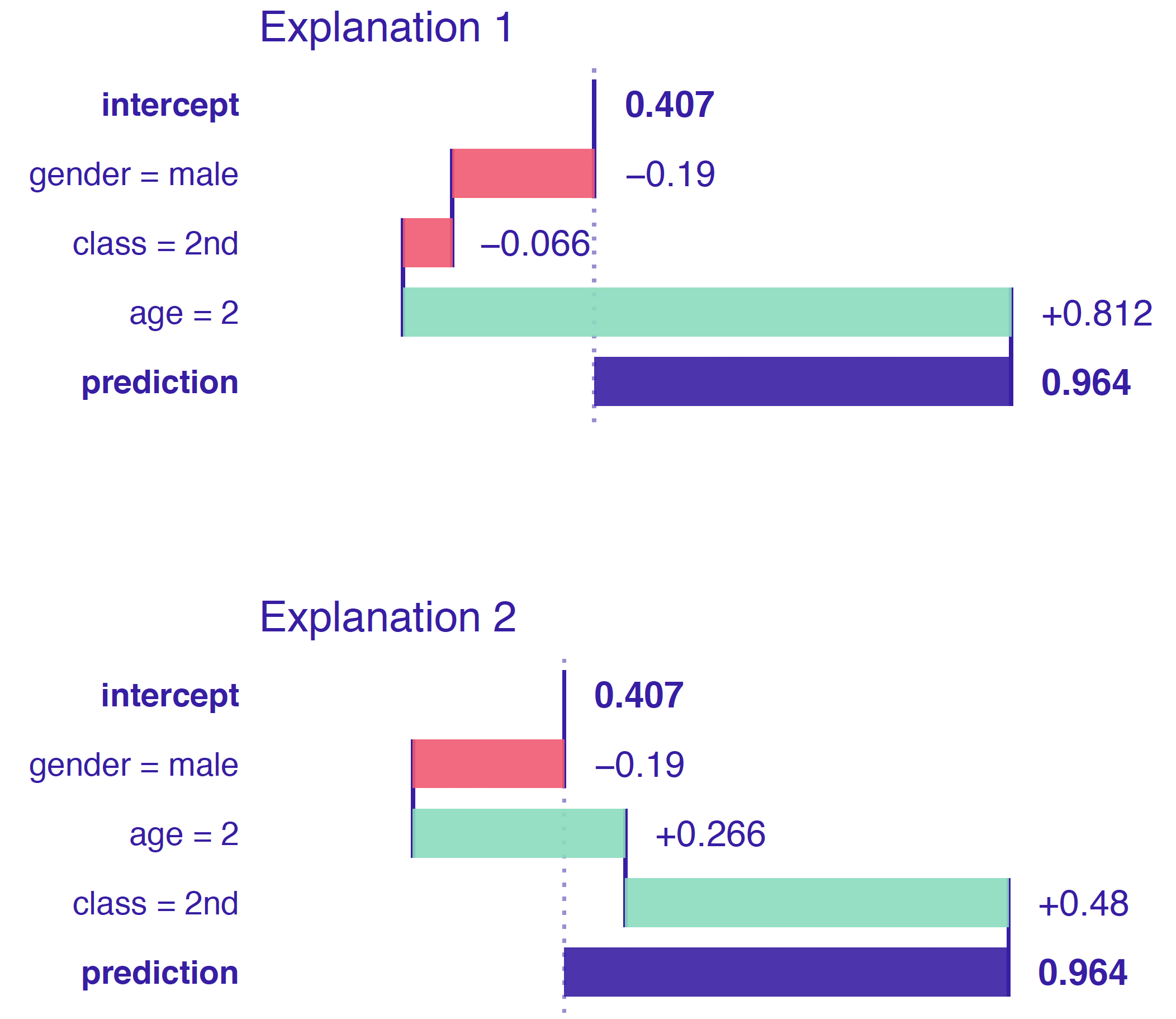
Figure 2.45: Break Down output for the same observation but with different order of variables. Variables age and class interact with each other. Hence the change in order results in different values on plots.
- Shap
Shap (Scott M. Lundberg and Lee 2017) is a direct response to the biggest problem of Break Down method that is the ordering chosen for explanation being able to alter the results. Shap takes a number of permutation and calculates the average response of Break Down on these permutations. More permutations result in more stable explanations. Exemplary output is shown in figure 2.46.
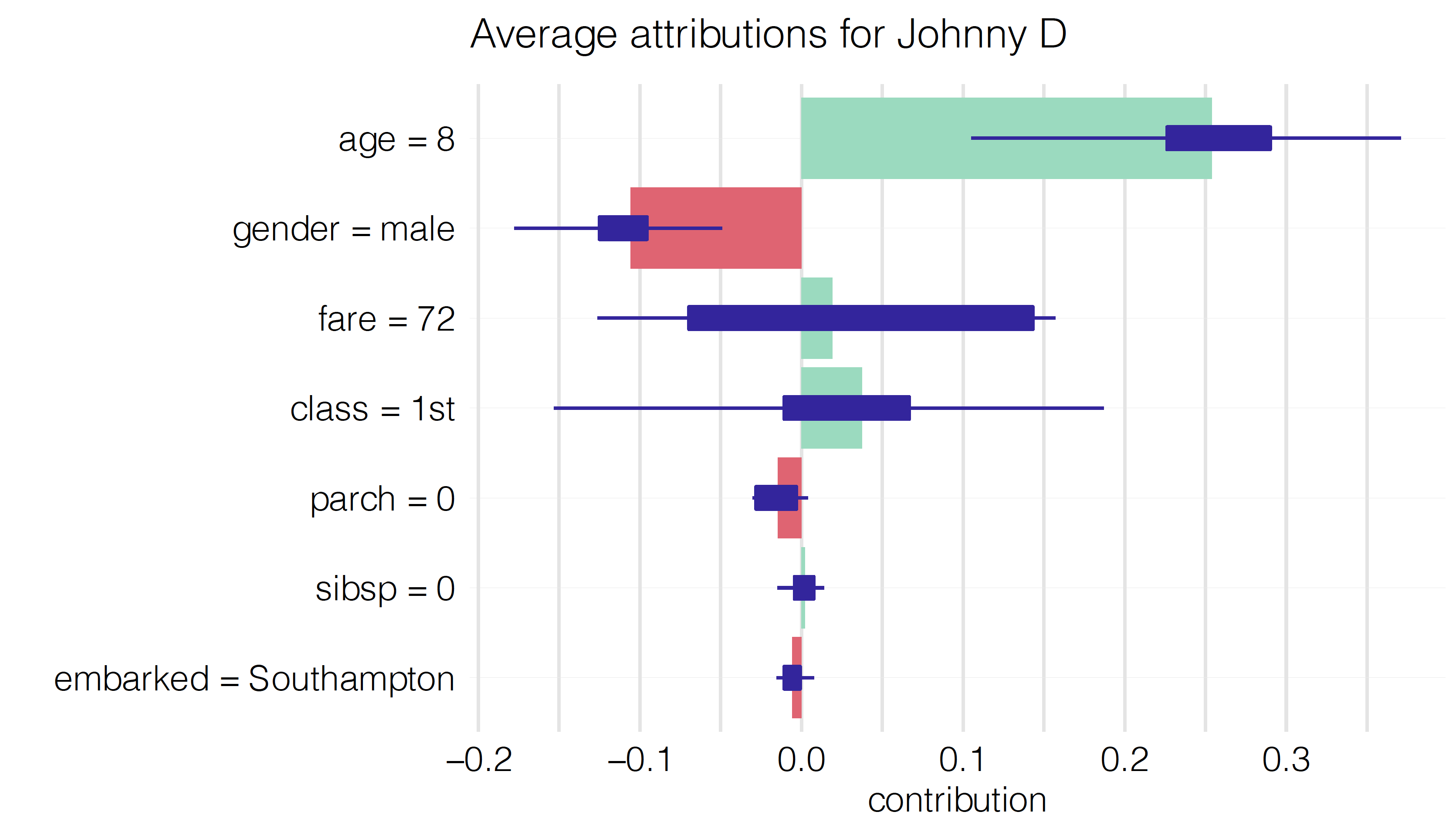
Figure 2.46: Shap output for Johny D observation. Average impact of the variable on the prediction calculated with Break Down for 10 permutations, with boxplots showing the distribution of impacts from different permutations.
- Lime
The essence of Lime (Ribeiro et al. 2016a) is to locally approximate the black box model with a glass box one. Then we can use it for local explanations that should yield results appropriate for the black box. Firstly, we generate data “close” to our observation (also called Point of Interest) and make predictions with black box model. Based on those predictions we try to fit the glass box model that accurately predicts those observations. In result we receive a glass box model that should behave the same as original model as long as we remain close to the Point of interest. Figure 2.47 describes the idea.
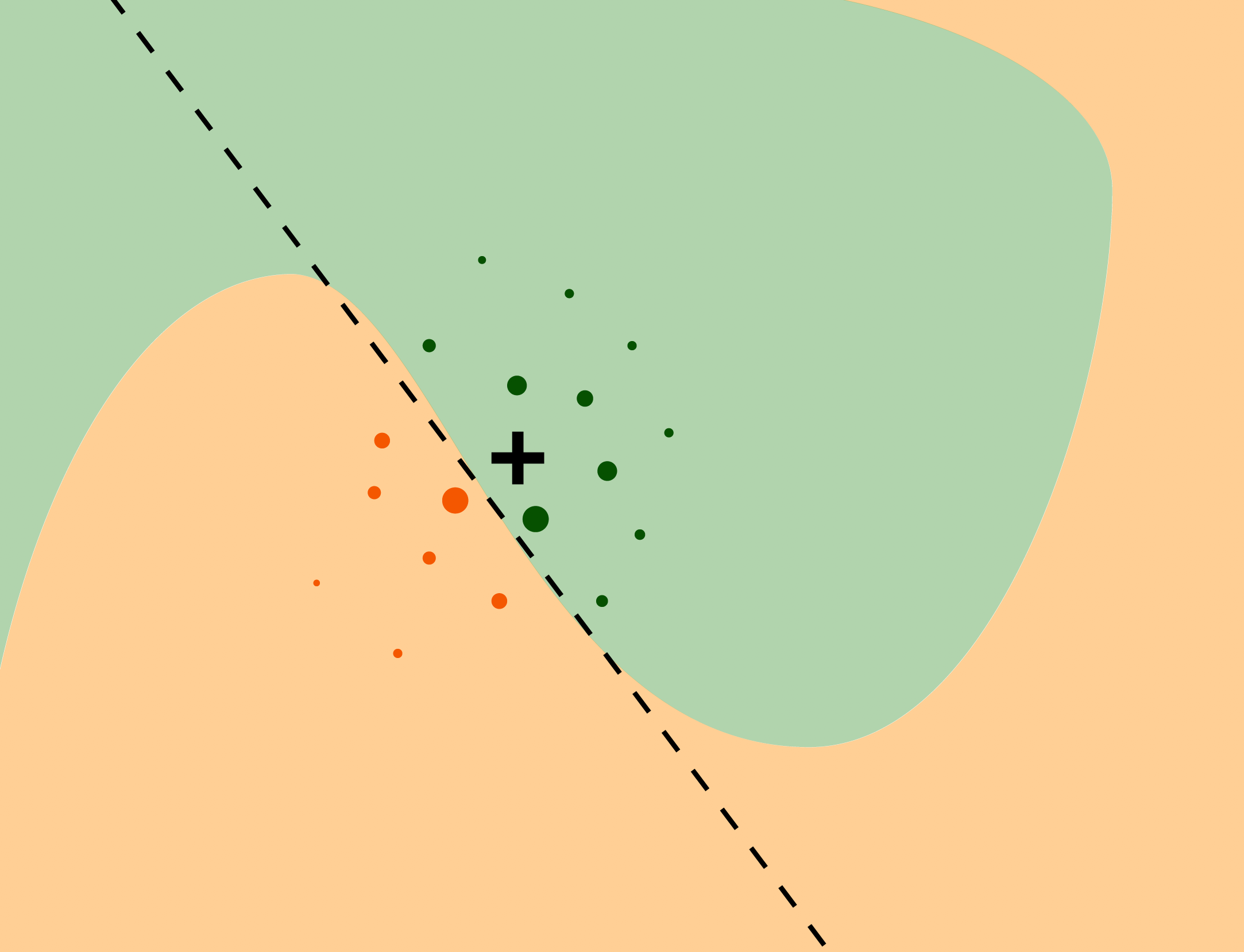
Figure 2.47: Colored areas correspond to different prediction for the black box model. Black cross is our Point of Interest and circles are generated data. The line represents our simpler model that approximates original model around Point of Interest.
This method is often used for datasets consisting of many variables. Methods like Break down and Shap come out short in these situations.
- Ceteris Paribus
Ceteris Paribus (Przemyslaw Biecek and Burzykowski 2021a) is a Latin phrase meaning “all else unchanged.” This accurately describes what it does. For the certain observation we take values that are interesting to us and observe how the prediction changes as we change values in those columns one at a time. This can yield interesting conclusions about change in values and its impact on predictions. Figures 2.48 and 2.49 show prediction change as response to variable change.
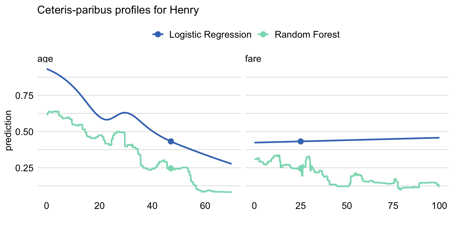
Figure 2.48: Ceteris-paribus profile for observation Henry using Logistic Regression and Random Forest models. Shape of lines shows how the prediction would change depending on the value of age and fare variables with all the other variables unchanged. Dot shows the real value and models prediction for this particular observation.
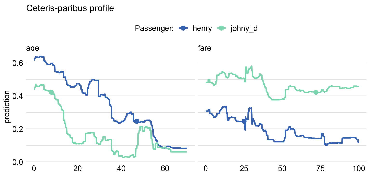
Figure 2.49: Ceteris Paribus profile using Random Forest for two observations.Shape of lines shows how the prediction would change depending on the value of age and fare variables with all the other variables unchanged. Dot shows the real value and models prediction for this particular observation.
Ceteris Paribus is very popular due to its simplicity and interpretability. The biggest drawback however is the possibility of unpredictable or misleading results. For example, with fixed variable age set to 18, predicting outcome for a significant number of pregnancies does not make sense. It is also hard to capture interactions when working with variables separately.
Global Explanations
As the name implies in global explanations we look at variables from the perspective of whole dataset. We can check the importance of variable for the model or analyze average impact of certain values on predictions.
- Feature Importance
The main idea behind Feature Importance (A. Fisher et al. 2018b) is measuring how important each variable is for model’s predictions. To do that we measure the change in AUC after permutating values of each variable. The bigger the change, the bigger importance of variable. To stabilize the results, we can measure average change for a number of permutations. In figure 2.50 we can see that variable gender is the most important for model’s prediction.
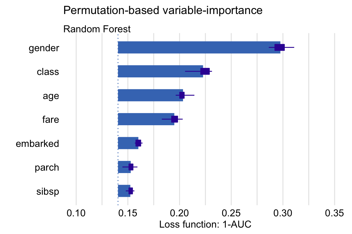
Figure 2.50: The average change in AUC after permutating values of each variable (Feature Importance) for 10 permutations, with boxplots showing the distribution of changes from different permutations.
- Partial Dependence
To put it short, Partial Dependence (Brandon M. Greenwell 2017c) is the average of Ceteris Paribus for whole data. This results in average importance and impact of variable and its values. The similarities can be observed in figure 2.51.
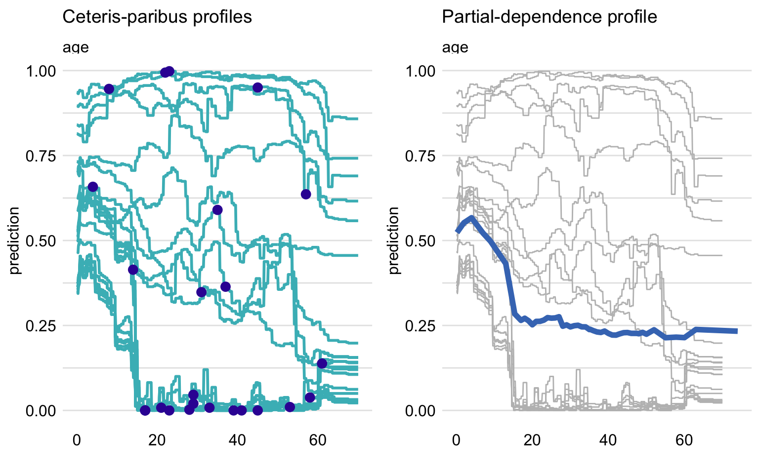
Figure 2.51: On the left panel, Ceteris Paribus profile for age variable for multiple observations. On the right, their average as Partial Dependence, showing how the prediction would change depending on the value of age.
As we can see observations can return different shapes for Ceteris Paribus, hence averaging them could mean loss of information. To answer this problem Partial Dependence implements grouping and clustering that could show the difference as shown in figure 2.52.
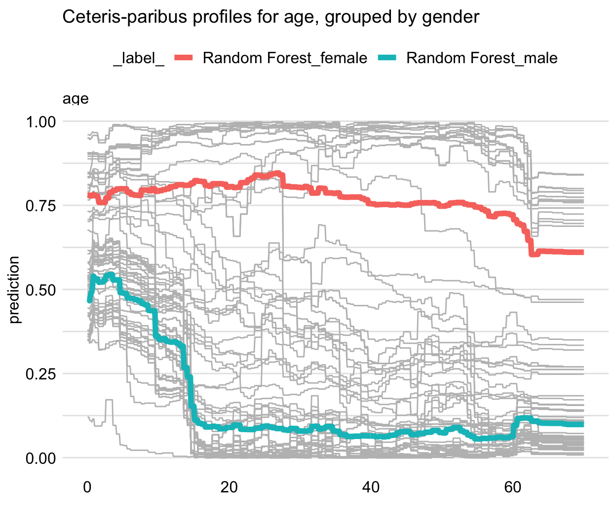
Figure 2.52: Partial Dependence of the prediction on the age variable for Random Forest model, with the observations grouped by gender. Shows how the average prediction differs for male and female passengers
Like Ceteris Paribus, this method is very simple and understandable. However, it also carries over the same problems resulting from correlated variables.
- Accumulated Dependence
Also referred as Accumulated-Local Dependence (D. W. Apley and Zhu 2020). It is the direct answer for correlation issue in Partial Dependence. The construction of Accumulated Dependence is the same as in Ceteris Paribus. The only difference being how the observations are summarized. Partial Dependence uses marginal distribution while Accumulated Dependence uses conditional distribution. This means that when there are at most negligible correlations, Accumulated Dependence yields results very similar to Partial Dependence.
2.4.5 Results
Dataset versions comparison
We compared the performance of the Ranger model with default values on the testing datasets, using AUC, Balanced Accuracy and False Negative Rate measures. The results are shown in the table 2.5.
| AUC | BAC | FNR | |
|---|---|---|---|
| original | 0.8173 | 0.7141 | 0.1529 |
| naomit | 0.8481 | 0.7260 | 0.0991 |
| mice | 0.8109 | 0.6736 | 0.1529 |
| skip | 0.8095 | 0.6779 | 0.1847 |
The naomit dataset has the best scores, however, using this dataset version may cause the loss of valuable information. Because of that, we are going to use original and skip versions for further analysis.
Model comparison
The models were checked with AUC, Balanced Accuracy and False Negative Rate measures on both original and skip dataset version, with the results shown in tables 2.6 and 2.7.
- Data Original
| AUC | BAC | FNR | |
|---|---|---|---|
| Ranger | 0.8194 | 0.7077 | 0.1656 |
| Ada | 0.8101 | 0.7487 | 0.1783 |
| Binomial | 0.8215 | 0.7030 | 0.1210 |
| GBM | 0.8186 | 0.6942 | 0.1656 |
| NaiveBayes | 0.8116 | 0.6946 | 0.1783 |
| RandomForest | 0.8155 | 0.7077 | 0.1656 |
The measure values between models are quite similar, however Ada has the best Balanced Accuracy and Binomial has the lowest False Negative Rate.
- Data Skip
| AUC | BAC | FNR | |
|---|---|---|---|
| Ranger | 0.8134 | 0.7014 | 0.1783 |
| Ada | 0.8230 | 0.7153 | 0.1911 |
| Binomial | 0.8223 | 0.7197 | 0.1146 |
| GBM | 0.8146 | 0.6875 | 0.1656 |
| NaiveBayes | 0.8276 | 0.7372 | 0.1338 |
| RandomForest | 0.8061 | 0.7018 | 0.1911 |
On this dataset version Binomial still has the lowest FNR, but no model has a significantly better results than the Ranger model.
Tuned models
Better results can be achieved with the use of parameter tuning. Based on the results, two models: Ranger and Ada were chosen for further experiments. Hyperparameter tuning using random grid search and FNR as a minimalized measure was performed, resulting in classificators with the following parameter values:
- Tuned Ranger
- num.trees = 776,
- mtry = 1,
- min.node.size = 8,
- splitrule = “extratrees”
- Tuned Ada
- loss = ‘logistic,’
- type = ‘discrete,’
- iter = 81,
- max.iter = 3,
- minsplit = 45,
- minbucket = 4,
- maxdepth = 1
The tuned models were checked with AUC, Balanced Accuracy and False Negative Rate measures on skip dataset version, with the results shown in table 2.8.
| AUC | BAC | FNR | |
|---|---|---|---|
| Tuned Ranger | 0.8664 | 0.7375 | 0.1111 |
| Tuned Ada | 0.8447 | 0.6937 | 0.1528 |
The performance measures of tuned models are higher than the original ones and ranger still proves to be a better classificator on this dataset.
Global explanations results
In this section we’ll explain the prediction of the Ranger and Ada model on th skip dataset version.
Figure 2.53 shows Feature Importance for both Ada and Ranger models. As we can see, both agree with each other as to what variables are most important to them. Their predictions are mostly based on the values of plas variable and then mass and age come second.
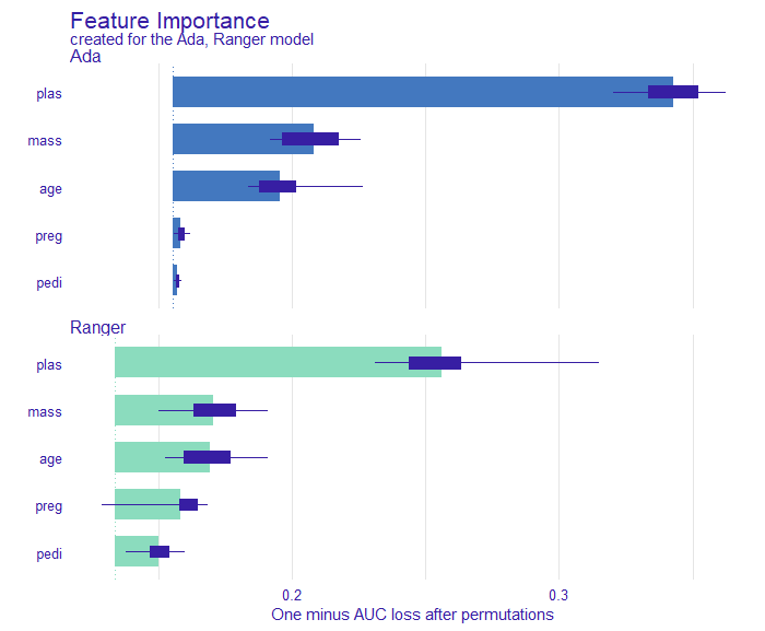
Figure 2.53: Variable importance for Ada and Ranger based on average AUC loss after 10 permutations of this variable. Boxplots show the distribution of changes from different permutations.
Partial Dependence profile seen in figure 2.54 gives us perhaps the most interesting results. Firstly, they are adequate to Feature importance in Figure 2.53. The more important variables return wider range of average prediction and less important give less varied predictions. Secondly, we can observe the difference in model’s inner characteristics based on the shape of their PDP functions. Ada is more edgy and straight while Ranger is more smooth. Based on results yielded by PDP and according to these two models we can conclude that, generally speaking, the bigger the values the higher the chance of positive diabetes test result.
Some other key observations include:
- For Ada model, little to none impact by change of
ageafter 35 years of living. For ranger, a peak in the prediction value around the age of 50. - A sudden increase in prediction with
massreaching 30 (the border of obesity in BMI model). - Almost no change for Ada prediction with change of
pedi. - A slight increase in prediction with 7th
pregnancy.
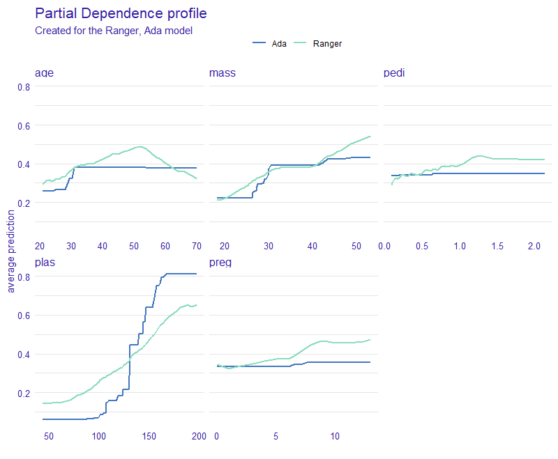
Figure 2.54: Average predictions with PDP for Ada and Ranger, showing how the prediction would change depending on the value of given variable. Shows the trend, that for most cases the bigger the value of variable the higher the chance of positive diabetes test result.
Accumulated Dependence gave us similar results to Partial Dependence, thus we can conclude that our dataset does not contain any problematic correlations. Comparison between PD and AD is plotted on the figure 2.55 for mass variable.
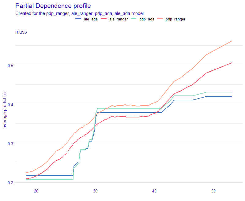
Figure 2.55: Average predictions with PDP and ALE for Ada and Ranger. Simmilar shape of the PDP and ALE plots for each respective model indicates no problematic correlations with mass variable.
Local explanations results
Local explainations for Ada and Ranger models are very similar, therefore we focus on the one with a bit better metrics - Ranger.
Ceteris Paribus shows us results adequate to Pratial Dependence Profile (See Figures 2.56 and 2.57). Predictions are very consistent in variable plas. However in age and pedi cases we can spot different trends in prediction behaviour. This could hint towards potential interactions between variables. As for mass and preg they differ mostly in initial prediction value. Overall tendency is rising.
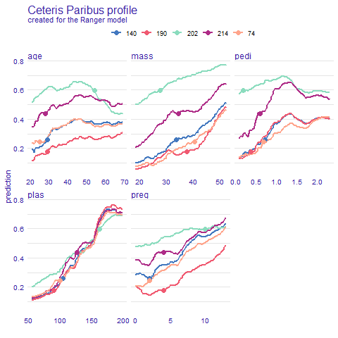
Figure 2.56: Ceteris Paribus predictions for five selected observations: 140, 190, 202, 214 and 74. Plot shows how the prediction would change depending on the value of given variable. Dot shows the real value and models prediction for this particular observation.
Observation 190
Let us analyze observation 190 in more detail. Lime explanation (Figure 2.57) tells us three biggest factors approximated by glass box model. Having plas lower than 100 in our case has significant negative impact on positive diagnosis of diabetes. On the other hand, having high mass value and being in 30’s adds to our probability of having diabetes.
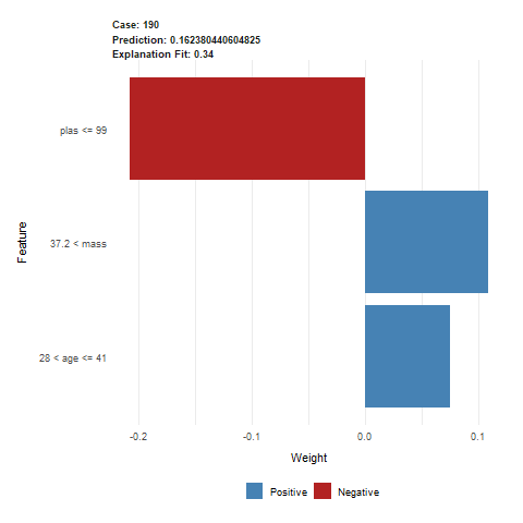
Figure 2.57: Lime output for observation 190. The predicted value was 0.162, indicating a healthy patient. This prediction was mostly influenced by a low value of plas variable, lowering the risk of diabetes. Patients age and mass slighly heightened the risk.
Breakdown and Shap (Figures 2.58 and 2.59) as opposed to Lime give us prediction change for exact values, not intervals. Because of that the results may be different. So is the case with the age variable which behaves differently for Lime. According to Breakdown and Shap being 29 years of age slightly decreases prediction but Lime says otherwise. Not only it increases but also by a significant amount. Other variables seem to match their impact if just scaled down a bit for BD and Shap.
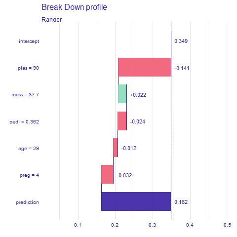
Figure 2.58: Breakdown output for observation 190, influences of each variable of the prediction - red indicates lowering, and green heightening the prediction value
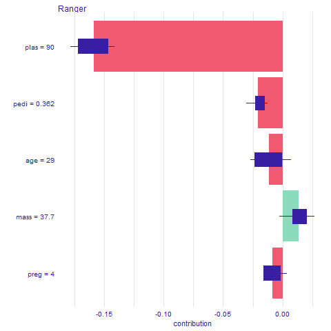
Figure 2.59: Shap output for observation 190. Average impact of the variable on the prediction calculated with Break Down for 10 permutations, with boxplots showing the distribution of impacts from different permutations
Observation 214
The next observation we analyze is observation 214 for which the model has a prediction of about 44% for positive diagnosis of diabetes. Lime explanation (Figure 2.60) tells us that three biggest factors for this prediction are pedi, plas and mass. This time the first one is pedi with high value of over 0.5. Despite high values of plas (over 115) and mass (over 33), the prediction is higher than average for this dataset but still lower than 50%.
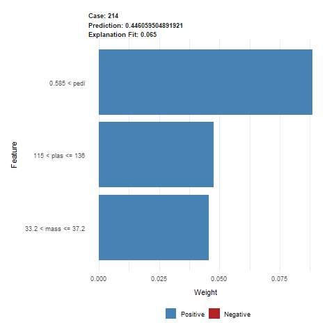
Figure 2.60: Lime output for observation 214. The predicted value was 0.446, indicating a healthy patient, but with less certainty. This prediction was mostly influenced by higher values of pedi, plas and mass variables.
Breakdown and Shap (Figures 2.61 and 2.62) show similar results, just toned down. The biggest difference is the impact of pedi which in Lime was nearly twice as big as the impact of plas and mass. The only value making it less probable that the observation would have diabetes is age equal to 28.
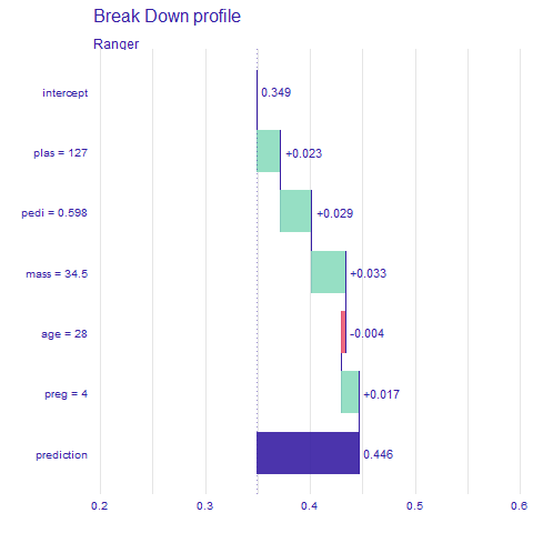
Figure 2.61: Breakdown output for observation 214, influences of each variable of the prediction - red indicates lowering, and green heightening the prediction value
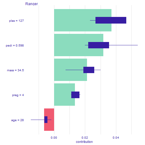
Figure 2.62: Shap output for observation 214. Average impact of the variable on the prediction calculated with Break Down for 10 permutations, with boxplots showing the distribution of impacts from different permutations
2.4.6 Expert opinions
According to experts there are two main types of diabetes:
type 1 diabetes, where the body does not make insulin. It is mostly caused by genetic and environmental factors
type 2 diabetes, where the body does not make or use insulin well. It is the most common kind of diabetes. It is caused by several factors, including lifestyle factors and genes
Unfortunately, we do not have any data about the type of diabetes that was found among the patients in the investigated dataset. However, since type 2 diabetes is the most common type, and some of the factors causing the different types are common, we will focus mostly on the risk factors for type 2 diabetes.
Causes of type 2 diabetes
According to the National Institute of Diabetes and Digestive and Kidney Diseases (NIDDK), type 2 diabetes can be caused by several factors:
obesity and physical inactivity - Extra weight sometimes causes insulin resistance and is common in people with type 2 diabetes.
insulin resistance - Type 2 diabetes usually begins with insulin resistance, a condition in which muscle, liver, and fat cells do not use insulin well. As a result, body needs more insulin to help glucose enter cells. At first, the pancreas makes more insulin to keep up with the higher demand. Over time, the pancreas cannot make enough insulin, and blood glucose level rises.
genes and family history - As in type 1 diabetes, certain genes may make you more likely to develop type 2 diabetes. Genes also can increase the risk of type 2 diabetes by increasing a person’s tendency to become overweight or obese.
ethnicity - Diabetes occurs more often in these racial/ethnic groups:
- African Americans
- Alaska Natives
- American Indians
- Asian Americans
- Hispanics/Latinos
- Native Hawaiians
- Pacific Islanders
age - Type 2 diabetes occurs most often among middle-aged and older adults, but it can also affect children.
gestational diabetes - Gestational diabetes is the type of diabets that develops during pregnancy and is caused by the hormonal changes of pregnancy along with genetic and lifestyle factors. Women with a history of gestational diabetes have a greater chance of developing type 2 diabetes later in life.
Comparison with achieved results
The causes of diabetes according to experts directly correspond with the columns in the explained dataset:
plas- plasma glucose concentration, can indicate whether the patient suffers from insulin resistancemass- Body Mass Index (BMI) can be one of the indicators whether patients’ weight puts him at risk for type 2 diabetesage- older people are generally more likely to develop diabetespedi- pedigree function is meant to be an indicator of patients’ risk for diabetes based on their genes and family historypreg- women that have been pregnant multiple times are more likely to develop gestational diabetes, and therefore, type 2 diabetes later in life.
Since all the women in the dataset have the same ethnicity, it is not a factor that can be considered valuable in this experiment. Since American Indians are more prone to diabetes, the results of studies on this dataset should not be invoked when diagnosing patients of other ethnicities.
2.4.7 Conclusions
The exploration of Diabetes dataset resulted in a discovery of initially unnoticeable NA values. After further examination of features distributions, we found out that skin, insu, pres, mass and plas have a significant amount of zero values which should not be present. After testing different datasets built by omitting and imputing variables or skipping observations, we concluded that the best solution would be removing skin, insu and pres variables and imputing mass and plas.
Moving forward we tested a number of popular Machine Learning models on our data. Measures like AUC, BAC and FNR showed us that Ranger and Ada models give us sufficient results to draw conclusions from.
After inspecting explanations on said models, it appears that, generally speaking, the bigger the values of variables other than age the higher the chance of positive diabetes test result. For Ada model, little to none impact by change of age after 35 years of living. For ranger, a peak in the prediction value around the age of 50. There is a sudden increase in prediction with mass reaching 30 being the border of obesity in BMI model. We observe almost no change for Ada prediction with different pedi values. There seems to be a slight increase in prediction with the 7th pregnancy.
In this scenario the causes of diabetes indicated by the XAI methods match the causes presented by the medical professionals. The Explainable Artificial Intelligence is an extremely helpful tool - it can be used to gain better understanding of the classification models, especially the ones used for making medical diagnosis, where this understanding is crucial to patients’ health and safety.
Further studies on diabetes prediction could include different ethnicity groups and genders. The medical data for models could be more complete and complex. Data with no missing values and potentially more features could also lead to more accurate models.